
And, we’re live again. Thanks, gang, for bearing with my disappearing site while I worked on it.
The whole site was getting a little, shall we say, hairy, at least in terms of all those little drop-down menus and subcategories…. I am notorious for over-organizing things, with menus under menus and folders inside folders. (My laptop is an absolute labyrinth of folders and files — it’s a wonder I can ever find anything!)
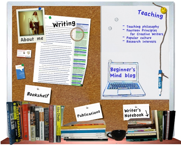
This cluttered sense of “organization” was probably best illustrated by the interactive “bulletin board” image I used to have on my home page. I was actually quite fond of that thing when I made it, and I still think the interactive image thing is pretty cool. But the more I looked at it, the more I realized it was just a jumbled collage of craziness. And I began to feel the whole website was a bit like that, really. Just a big, messy desk.
Then there was the “Polaroid” collage that was my banner. Again, it was fun to put together, but it was also starting to look awfully messy.
To be honest, the website itself (like my desk) is still pretty messy. I still have loads of pages and subpages scattered all over, some of which are actually harder to find now (did anyone actually like my “Photos” page? Because that’s practically buried now). But those are the pages almost no one visits, and that I mostly did for fun — there are more important pages on the site that tell you something about me or my work.
So that’s the bulk of what I did with the redesign: I stripped out the menus. Now the most important information is all up top, and for your convenience it all gets repeated down at the bottom, too, in a footer menu. Only two menu items function as drop-downs now, and there are no more submenus (so no more chasing drop-downs underneath pop-outs inside of drop-downs…).

I also replaced the cover image with a little graphic I made for my forthcoming chapbook, Box Cutters. When the official cover comes out from Sunnyoutside Press, I’ll replace my graphic with their (much cooler) cover.
And I swapped out that cluttered banner for just a nice, clean image of my name (written by my wife especially for the site — thanks, Jennifer!).
The category cloud in the sidebar was another good example of how jumbled the blog was starting to feel to me, so I pulled it and replaced it with a new side-list of the most popular categories or features here on the site.
Also, because my lists of links to authors and presses and cool blogs was getting unbearably long, I moved them all out of the sidebar and made a new Links page. Please do visit it — I would still love all my friends and acquaintances and colleagues to keep getting traffic.
So, that’s it, folks. What do you think? Anything you used to visit all the time and miss now? Anything new you’d like to see on the site?

Minimal, masculine, a whole lot of other stuff beginning with m. 🙂
M
Mmm! ; )
Like it. This is why I cannot do technology anymore, not enough knowledge of how to do all of this organization, etc. Especially like the side list. Keep up the good work!
You and me both, Mom. I didn’t even think until this morning how the site might look on a tablet or a smartphone. Apparently, this is something I’m supposed to always be aware of (for some idiotic reason, people are online on their phones more than they are on computers — and I just can’t think that way, even with my fancy new Note II).
Fortunately, stripping the site down was the right idea, because it looks FAR better on my Note II than the old site design did!